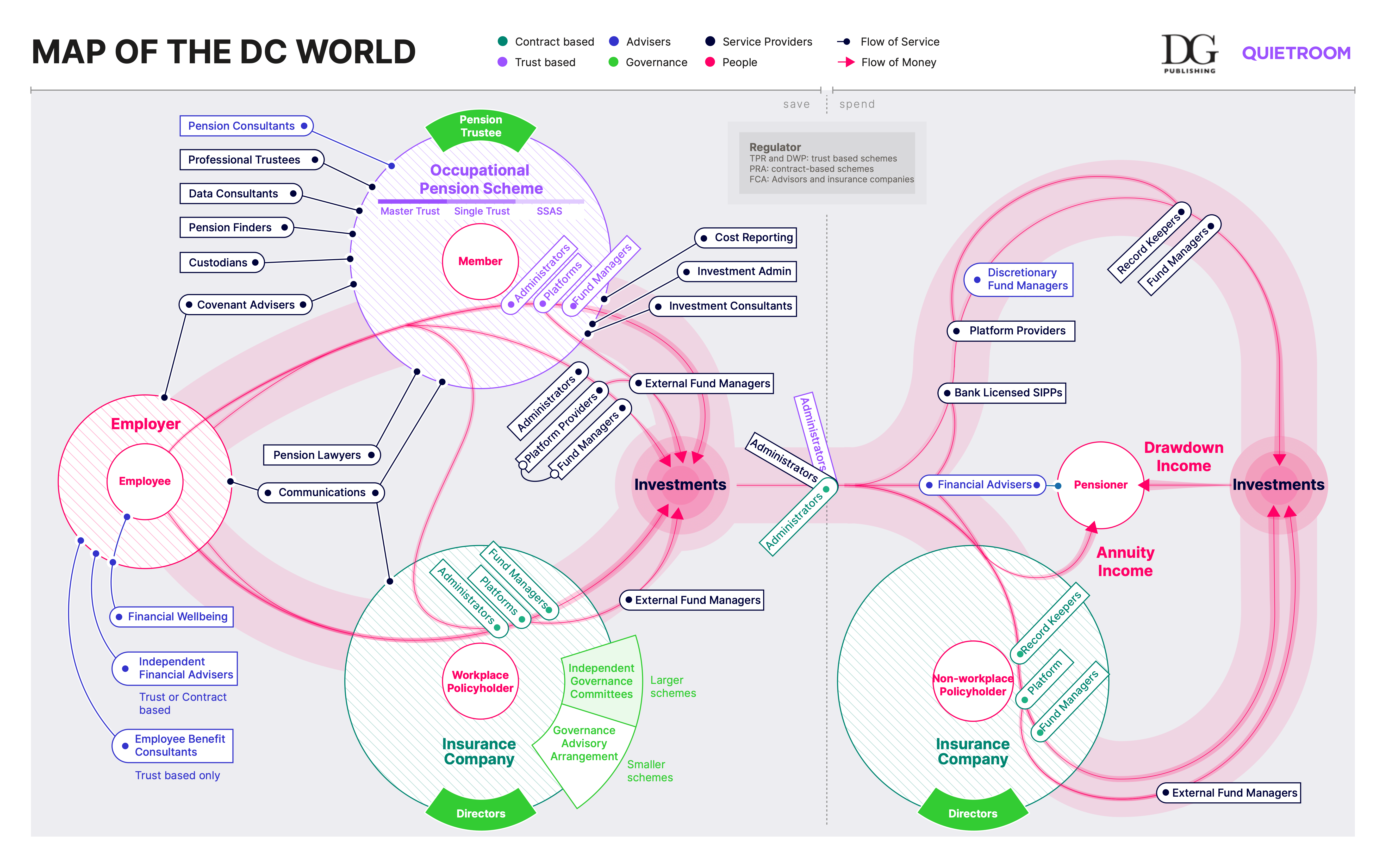
Get a bird’s eye view of how the DC pensions world fits together.
In the pensions industry, we tend to be very good at talking about process. We’re used to sequences of thought that run in straight lines. But any description or explanation, however good, starts from someone’s point of view – usually our own. We find it harder to imagine ourselves in different parts of the industry, or in the shoes of a member.
A map shows you the world in a different way. It frees you from a single point of view and lets you choose your starting point, your end point and your route.
So here’s our map of the Defined Contribution pensions world.

Industry experts contributed to the DC pensions map
We invited industry leading lights to get together and plot out a map of the DC world on post-it notes and a whiteboard. We kept reviewing and refining what we’d crafted until we were ready to work with a designer to create the map you see here.
We’re very grateful to everyone involved. And special thanks to Andrew Carrett, Bob Cast, David Hutchins, David Whitehair, Henry Tapper, Jacqui Reid, Nick Groom, Lucian Camp, and Tom Hibbard for their help.
We also worked with DG Publishing on the map. They’re the go-to source for pension know-how and events – from local authority pension funds to large corporate schemes.
Use the DC pensions map to start conversations
How is our world changing? Which parts are going to change more? What will be the effect of CDC? Consolidation? Or the dashboard?
We don’t have one specific purpose in mind for the map. We want it to start conversations in the industry and help people talk about what they do.
We’ll keep updating the map
This is version 1 of the map. It represents the collected knowledge of many industry experts. But it will keep evolving as the DC world develops, and as more people tell us how they see the world.
If you’d like to help with future versions of the map, email Quietroom’s development lead, Joe Craig.

